Slide Templates
150+ board-grade slide patterns, organized by who uses them. Each renders to editable PowerPoint through a deterministic intent — no AI drawing your slides, no mangled text. Every one takes a theme — including your own company template, rendered natively. $0.05 per slide.
Management Consulting
Board-grade strategy, diligence, and recommendation slides in real PowerPoint.
Capabilities — how we deliver value
A capabilities slide for a consulting pitch: the service areas, the outcome each drives, and proof.
Case study — the engagement and its impact
A consulting case study: client situation, the challenge, the approach taken, and the measured impact.
Diligence scorecard — the target assessed
A due-diligence scorecard: the target assessed across the dimensions that decide the deal, with the verdict per area.
EBITDA bridge — what moved plan to actual
A plan-to-actual EBITDA bridge: the drivers that helped and hurt, building from plan to the actual result.
Engagement status — workstreams at a glance
An engagement status board: each workstream with RAG status, progress, owner, due date, and next action.
Executive summary — the recommendation and why it holds
A board-grade executive summary: the governing recommendation, the context that forces it, the analysis behind it, and the decision asked for.
Sales & Presales
Proposals, battlecards, QBRs, and demo decks that stay on-brand at volume.
Account plan summary — the play and the ask
An account-plan executive summary: the strategy for the account, why now, the proof, and the internal ask.
Customer story — the outcome a peer achieved
A sales case study: a peer customer's situation, challenge, the approach, and the result they got.
Deal battlecard — where we win this opportunity
A deal-level battlecard: how we stack up against the named competitors on the criteria this buyer weighs.
Partner tiers — grow with us
A partner program slide: the tiers, who each is for, and the benefits and commitments.
Product demo — the capabilities that close the deal
A product demo overview: the core capabilities mapped to the buyer's outcome, with proof points.
Requirements fit — how the proposal meets the spec
An RFP-response fit matrix: the buyer's requirements mapped to how the proposed solution meets them versus alternatives.
Corporate & Business
Executive summaries, business reviews, and reporting decks for internal leadership.
All-hands — the priorities for the year
An all-hands anchor slide: the theme, the company priorities, and what each person can do.
Board update scoreboard — performance against plan with the one red flag
A board-meeting opener: revenue, margin, cash, and a leading risk metric, with highlights, risks, and decisions needed.
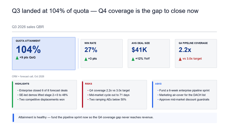
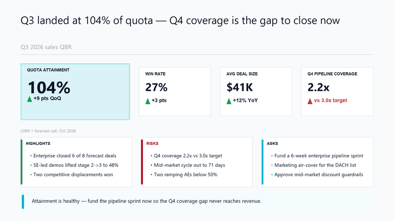
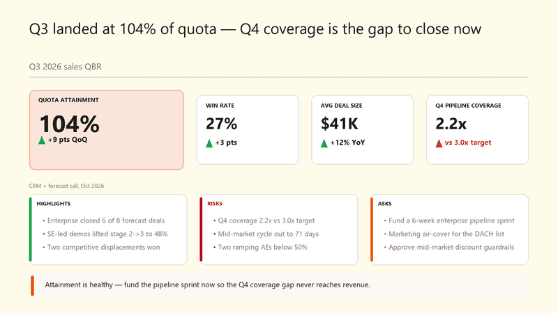
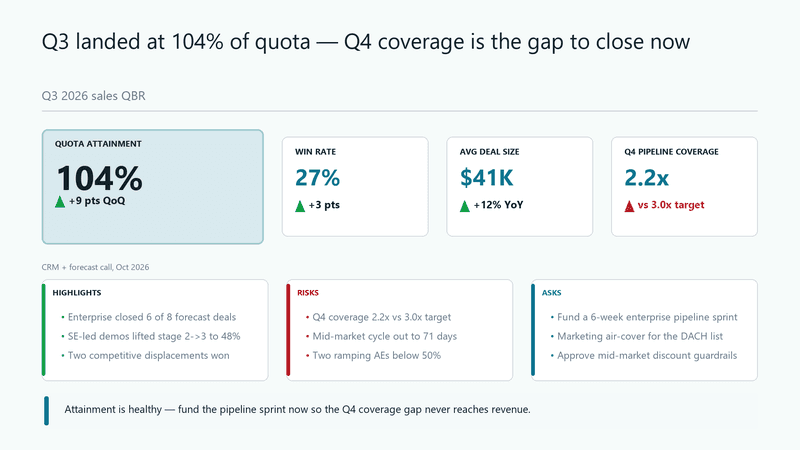
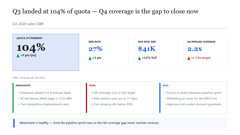
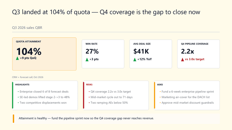
Business review scoreboard — performance and the watch item
An internal QBR opener: revenue, margin, NPS, and a leading risk, with highlights, risks, and actions.
Capability maturity — the climb over the program
A maturity staircase for an internal transformation: current rung and the year-by-year climb.
Capability overview — what the solution does
An internal product/solution overview: the core capabilities and the outcome each delivers.
Competitive position — where we stand
An internal competitive analysis: how the company compares to key rivals on the dimensions that matter.
Startups & Investors
Pitch decks, investor updates, and market-sizing slides by stage.
ARR bridge — net new growth
An ARR bridge: how new business, expansion, and churn move starting ARR to ending ARR.
Board update scoreboard — the metrics that matter
A startup board scoreboard: ARR, growth, burn multiple, and runway, with highlights, risks, and asks.
Company summary — the one slide that frames the round
An investor executive summary: what the company is, why it matters, the traction, and the ask in one frame.
Competitive landscape — why we win
An investor-deck competitive slide: how the company differentiates against incumbents and alternatives on what matters.
Customer proof — the result an early customer got
A traction proof point: an early customer's situation, challenge, approach, and measurable result.
Investment scorecard — the thesis tested
An investor diligence scorecard: the opportunity scored across the criteria that drive the decision.
IT & Professional Services
Status reports, technical proposals, and delivery artifacts for steering committees.
Account review scoreboard — delivery health
An IT services account QBR: SLA attainment, delivery throughput, satisfaction, and a risk, with highlights and asks.
Alliance tiers — how we go to market together
An alliance/partner slide: the alliance tiers, the joint value at each, and the commitment.
Case study — measurable delivery outcome
A delivery case study: the client situation, the challenge, the approach taken, and the measured result.
Cloud maturity — where you are and the climb
A cloud/technology maturity staircase: current rung and the path to a modern operating model.
Delivery methodology — the path to the outcome
A methodology slide: the sequential workstreams that converge on the engagement's target outcome.
Delivery roadmap — phased to value
A delivery roadmap: phases from foundation to scale, each with a goal, deliverables, and the gate to clear.
Marketing & Agencies
Campaign plans, performance reporting, and brand-forward client deliverables.
Agency capabilities — what we bring
A capabilities slide for an agency pitch: the core services, the outcome each drives, and a proof point.
Agency competitive battlecard — where we win the pitch
A positioning battlecard for a new-business pitch: how the agency stacks up against the two incumbents on the criteria the client cares about.
Campaign case study — the result the work drove
A marketing case study: the client situation, the challenge, the creative/media approach, and the measured result.
Campaign performance scoreboard — spend, pipeline, and the channel to double down on
A campaign wrap-up: spend, MQLs, pipeline sourced, and CAC, with what worked, what didn't, and where to reallocate.
Campaign roadmap — the year in flights
A marketing roadmap: campaign flights across the year, each with its goal, deliverables, and the gate.
Channel program — partner tiers and what they get
A partner/channel slide: the partner tiers, who each is for, and the benefits and commitments at each level.
Government & Nonprofit
Policy briefings, grant proposals, and impact reports with structured layouts.
Briefing summary — the recommendation for decision-makers
A policy/program executive summary: the recommendation, the context, the evidence, and the decision requested.
Capacity-building tracks — by participant role
A training-program overview for a public-sector capacity-building effort: tracks by role, what each covers, and outcomes.
Impact report scoreboard — reach, outcomes, and cost per outcome
A donor-facing impact slide: people reached, outcomes delivered, cost per outcome, and funds deployed, with what's working and where the next funding goes.
Program approach — from design to scale
A program methodology: the sequential phases that converge on the program's intended outcome.
Program status board — delivery against milestones
A public-sector program status board: workstreams with RAG status, progress, owner, due date, and next action.
Proposal fit — meeting the funder's criteria
A funding-proposal fit matrix: how the proposed program meets each of the funder's criteria versus alternatives.
Education & Training
Workshop agendas, course material, and onboarding decks for trainers and L&D.
Enrollment funnel — where candidates drop before day one
A program enrollment funnel: applications through certification, with the biggest leak flagged between offer and enrollment.
Onboarding plan — the first 90 days
A 30/60/90 onboarding plan: each phase with its goal, what the new joiner does, and the checkpoint.
Ramp plan — from first week to independent delivery
An onboarding ramp as a capability staircase: what a new hire can do after week one, month one, quarter one, and year one.
Workshop tracks — from fundamentals to applied practice
A training-program overview slide: three workshop tracks, who each is for, and what participants will be able to do after.
Every template, in your brand
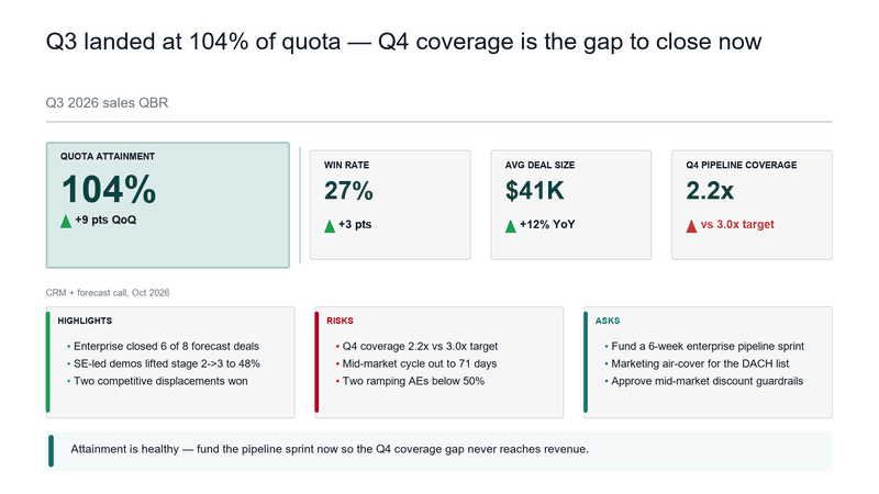
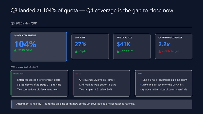
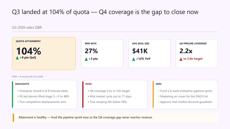
Theme docsThe same slide across the nine built-in themes — pass theme_id on any render. Or upload your company's .pptx template and slides render natively on your own file: master, layouts, and fonts intact.
Need a slide that isn't here?
Describe it in a brief and SlideForge routes it to the right pattern, or send your own structured intent. Same deterministic engine, same $0.05.
Open the Playground